Data
Reporting
data analysis | data visualization |
web app development
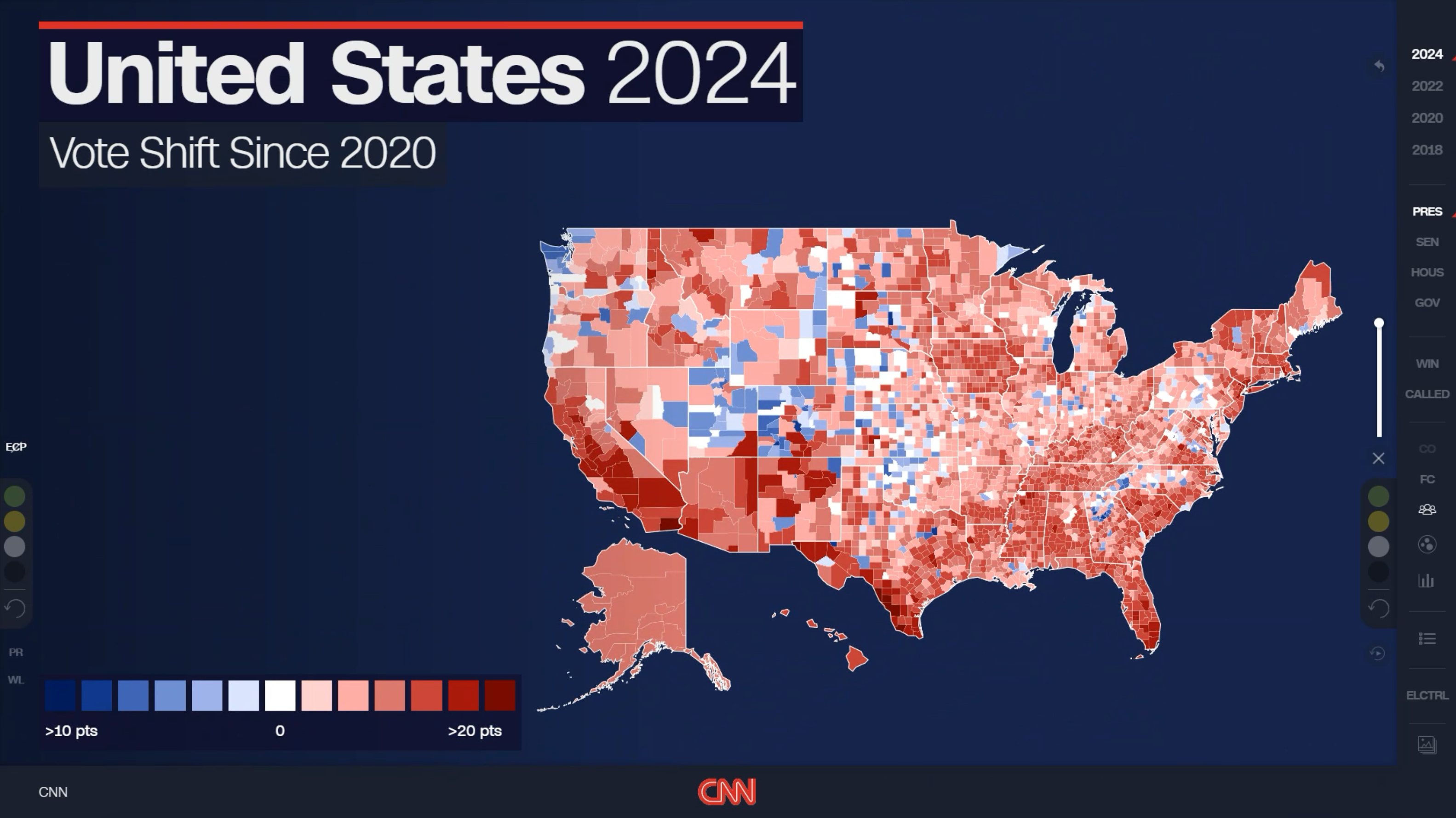
CNN Magic Wall
The data reporting behind CNN's on-air election coverage — voting data, win-margin analysis, and topical datasets spanning cost of living, health, and demographics — turned into clear, broadcast-ready visualizations.
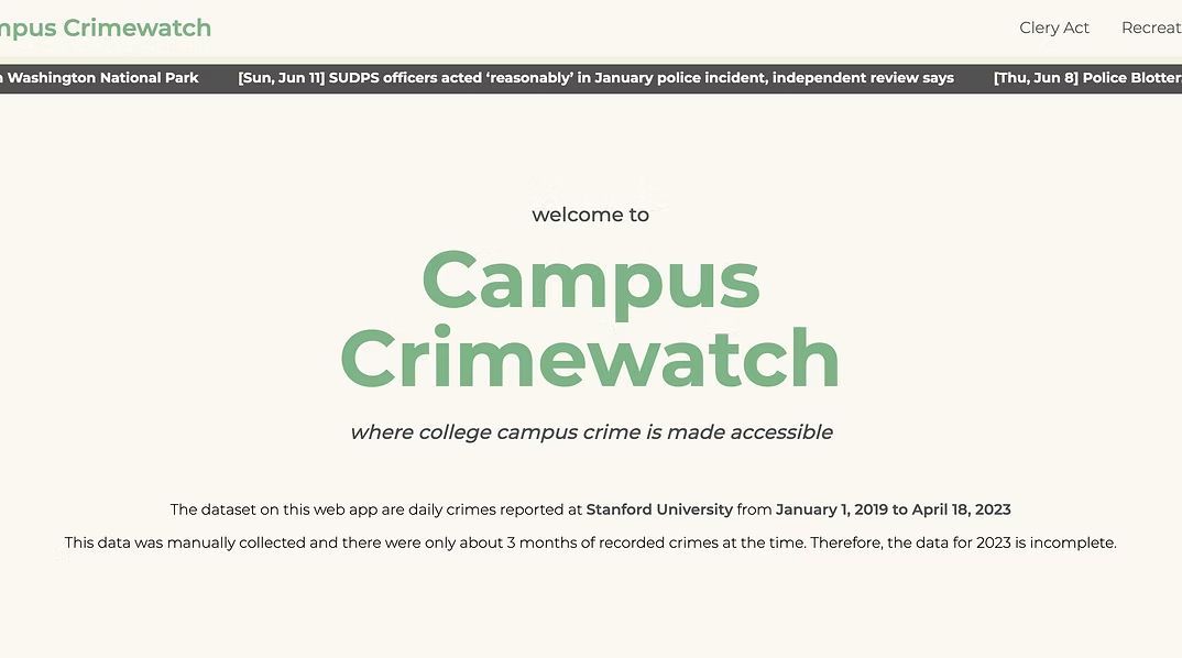
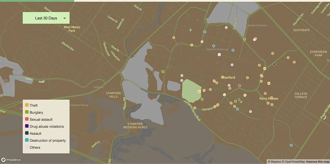
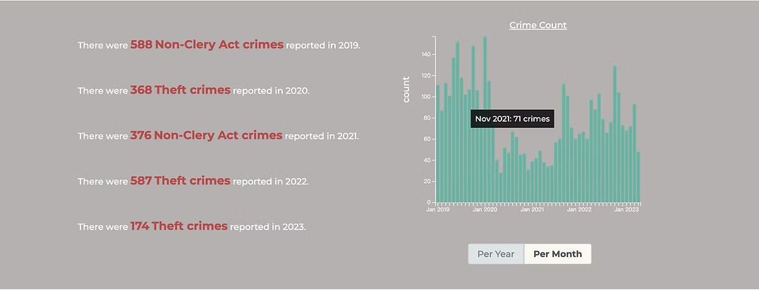
Campus Crimewatch
A reproducible web app featuring an interactive map of crime data for Stanford University and information about the Clery Act.
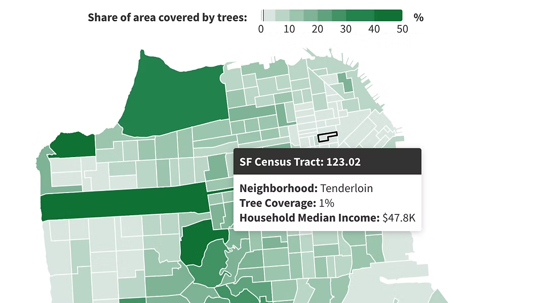
Rooting For Equality: street tree inequity in SF
Communities facing larger housing burdens, higher populations of people of color, and lower socioeconomic status often have fewer street trees.
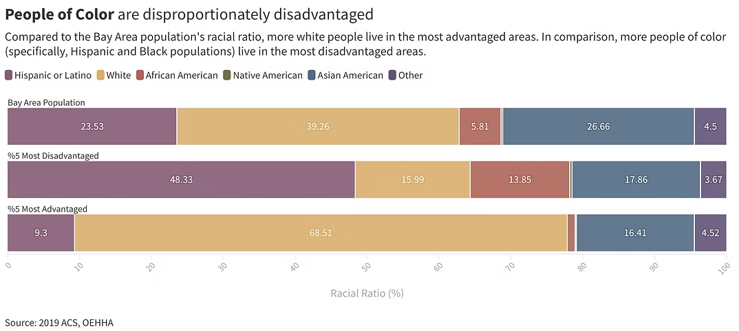
It's Hard To Breathe:
communities that are burdened by air pollution
Bay Area communities that are disproportionately burdened by air pollution.
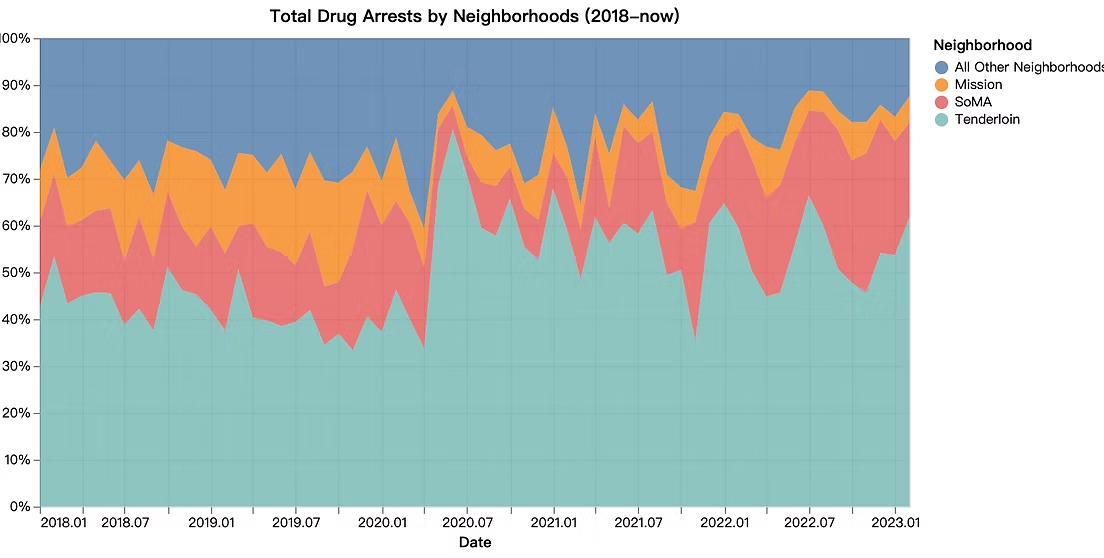
Visualizing the Drug Epidemic in San Francisco
San Francisco, a city celebrated for its vibrant and diverse cultures, has faced numerous challenges in recent years with regard to drug addiction and crime.